SPARC Manual
SPARC is SpiderRock Connect's central interface for monitoring and managing the full lifecycle of options trading activity — from order execution and position risk to hedging, risk controls, and the change requests that govern them. Rather than navigating across disconnected tools, traders and risk managers can track live activity, filter down to specific positions or orders, and act on aggregated data all within a single application. The interface is organized into modules, each combining high-level summary totals with progressively granular detail views, so users can move quickly between a broad portfolio snapshot and the individual records driving it.
Download SPARC as a desktop application here:
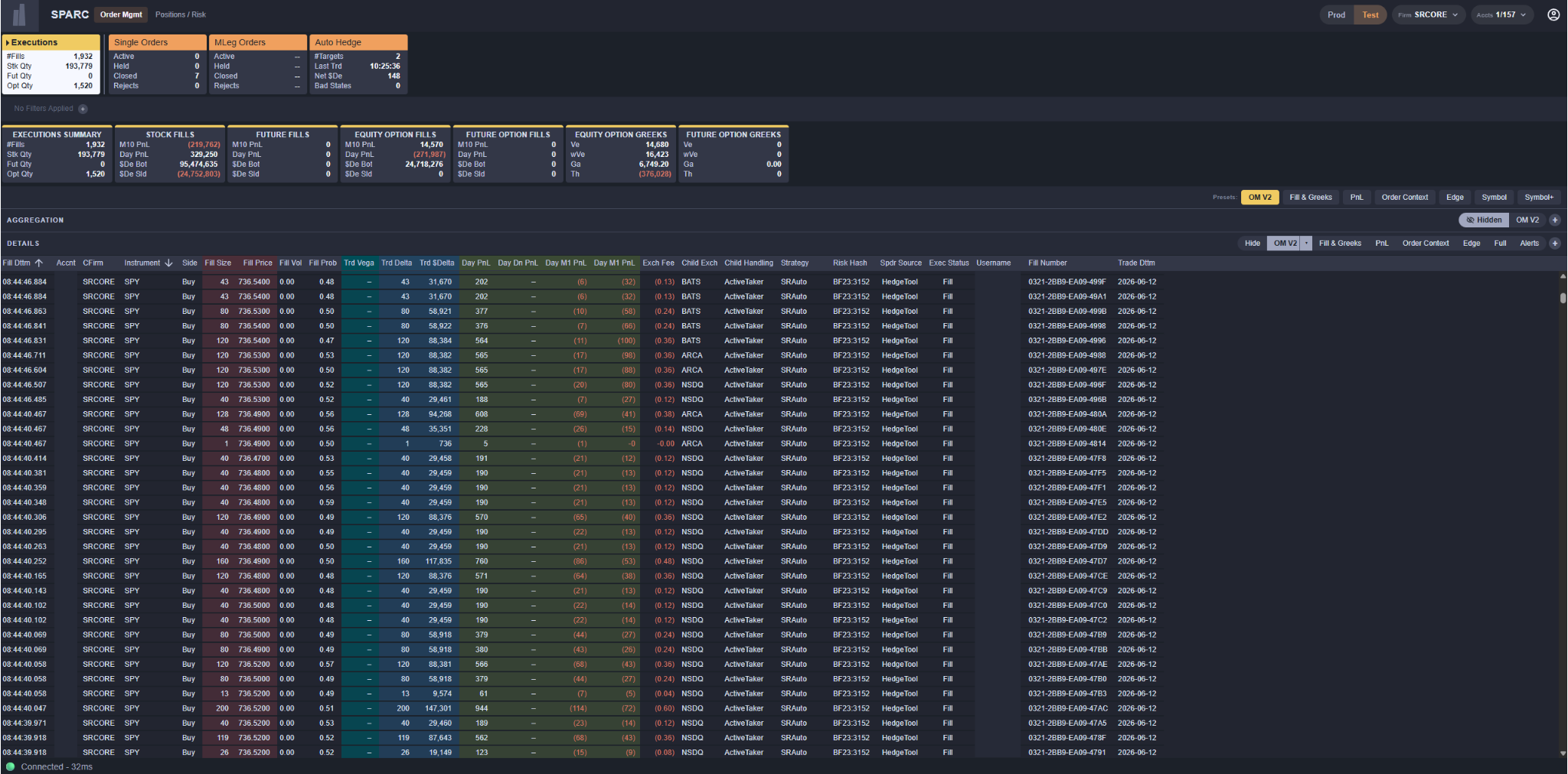
SPARC Application Components
SPARC is organized into modules covering order management, position and risk monitoring, hedging, and risk controls. Whichever module is loaded, the page is assembled from the same stack of sections, top to bottom:
- Header (top) – the always-visible app bar, with the group pills on the left and the firm, environment, and account selectors on the right
- SPARC Tabs – one tab per module in the selected group, with Dashboard pinned at the left edge
- Account Bar – account cards that narrow the page to a subset of the header selection
- Chip Filter Row – the filter row, with the Guide button at its right edge
- Summary Cards – filterable rollups specific to the active module
- Symbol Column and Charts – the per-symbol rail and the module's in-body charts
- Aggregations / Details (bottom) – the working surface, with a configurable aggregation pivot and a row-level detail grid
Everything applied in the Chip Filter row flows downward into the sections beneath it. The Header and the SPARC Tabs sit above the filter row and are unaffected by it.
A status indicator at the bottom of the window reports the connection state and the current round-trip latency to the server.
Header
The Header is the top-most band. Group pills on the left select which family of modules the SPARC Tabs show. On the right, three selectors set the scope every module inherits:
- Firm – the client firm the session is working under.
- Prod / Test – the environment toggle. Production and test records are kept in separate books; the toggle picks one at a time, never both.
- Accts – the account multi-selector. Everything below the header is scoped to this selection.
The gear at the far right opens SPARC Settings, which also carries the current user's details and the log-out control.
SPARC Tabs
SPARC Tabs sit directly below the header. Each tab corresponds to one module; clicking a tab loads it. The strip shows the modules belonging to the selected group, with the always-available Dashboard tab pinned at the left edge and separated from the rest by a hairline. The active tab inverts so the current module is unmistakable at a glance.
Tabs carry the module name only. The headline totals a user needs at a glance live on the Dashboard and in each module's Summary Cards, both of which respect the account selection and the chip filters.
Module Groups
Modules are organized into groups, and a group's pill is what puts its modules on the tab strip:
| Group | Modules |
|---|---|
| Order Mgmt | Executions, Single Orders, MLeg Orders, Auto Hedge |
| Positions / Risk | PnL, Risk |
| Risk Controls | MAR Risk Viewer, MAR Risk Ctrls, Supervisory Ctrls, SymRisk Counters, Change Requests |
Which groups a user sees depends on the role their credentials confer. Firm administrators and risk traders see all three groups; a risk watcher sees Order Mgmt and Positions / Risk only. A group with no modules available to the user does not render a pill.
Additional groups – policy hedging, auction responders, allocations, equity locates, degrossing, system notices, and firm settings – exist in the platform and will be enabled for clients in subsequent releases.
Switching Modules
The header presents groups as group pills – a single click selects a group and opens the page in it the user visited last (its first page by default); Ctrl/Cmd-click toggles additional groups in or out of view without changing the active page. When more than one group is selected, the tab strip divides into segments, each captioned with its group name.
Dashboard
Dashboard is the landing module and is always the left-most tab. It is a firm-wide overview of the selected accounts rather than a grid over one record type.
The account summary-card row at the top of the Dashboard is that page's own account selector – click a card to focus it, Ctrl-click to multi-select, ALL ACCNTS to clear – and everything below re-scopes to the selection.
Below it sit the firm summary boxes, split TOT / OPN / DAY and BOTH / BOT / SLD, the docked symbol column, and a stack of charts covering per-ticker values, order state, hedging, and fill timing. Exactly one summary box is the selected metric at any time, and the symbol column and the charts all follow it.
Account Bar
Below the SPARC Tabs, the Account Bar renders one card per account in the header selection, so a user can narrow a page without changing the session-wide scope. A plain click solos an account, Ctrl/Cmd-click toggles accounts in and out of a multi-selection, and the ALL ACCNTS anchor clears the narrowing. A search box filters the cards, and a mode control switches the row between individual accounts and client tag groups.
The bar hides itself where it has nothing to offer such as on modules that scope themselves (the Dashboard and the risk-control managers) and whenever the header selection holds a single account.
Chip Filter Row
The Chip Filter row sits between the Account Bar and the Summary Cards, and everything below it respects the filters it holds. Depending on the module, the row also carries permanent controls:
- A side segment – BOTH | BOT | SLD on Executions, BOTH | LN | SH on Auto Hedge. It filters the rows the grids and charts read and picks the value the Summary Cards display.
- A scope segment – TOT | OPN | DAY on the position modules, choosing Total (open plus day), Open (the overnight book), or Day (today's activity) as the measure every card reads.
Filter creation and behavior are covered under Global Functionality.
Summary Cards
Below the chip-filter row are a set of Summary Cards. Each card groups related metrics under a single topic and expands on what the module tracks – on Executions, for example, the cards cover day PnL, markout PnL, the traded greeks, notional, edge, and exchange fees.
Cards fall into two kinds:
- Measure cards are a focus group – exactly one is active at any time, and its measure drives the Symbol Column and Charts below.
- Class cards – EQUITY SH, EQT OPT CN, FUTURE CN, FUT OPT CN – show the current position or traded quantity per security class and act as the module's class filter. Clicking one solos that class across the page; clicking it again restores all four.
Summary Cards respect chip filters, so a user can watch a total narrow as a filter is applied. Where a card can filter, the whole card is the click target, and hovering a row inside one floats a small + / – toolbar for including or excluding that row's value. A module whose spec declares one also renders a summary chart to the right of its cards.
Individual cards can be hidden per module from SPARC Settings.

Symbol Column and Charts
Most modules dock a symbol column along the left edge, below the summary row. It carries one card per symbol showing the selected measure, and it is a filter: clicking a card narrows the whole page to that ticker, Ctrl/Cmd-click multi-selects, and re-clicking a sole selection clears it. A removable ticker chip appears on the chip row whenever the column is filtering. The column itself stays stable while it filters, so a user can always widen or clear the selection from it. Typing with nothing focused searches the column, and the sort control cycles through absolute and signed order.
To the right of the column, and above the grids, some modules render an in-body chart row:
- The Skew × Term grid buckets the selected measure by strike skew (rows) and expiry term (columns) on Executions, PnL, and Risk. Clicking, Ctrl/Cmd-clicking, or dragging across cells filters the page – rows commit security-type and skew chips, columns an expiration range.
- The fill-time histogram stacks the selected measure by class over time, positives up and negatives down. Dragging across it restricts the page to a time window; double-clicking, or the × on the resulting time chip, clears it.
Aggregations / Details
The bottom section of every module is where the bulk of analysis happens. It is split into two stacked panels:
- Aggregation (upper panel) – pivots the module's data by user-selected dimensions
- Details (lower panel) – shows the underlying row-level records
The Aggregation panel starts collapsed on every module, so the detail grid opens with the full height of the section. Opening both puts a vertical splitter between them that can be dragged to give either panel more space. Each panel also has its own Hide control in its header, so a user can collapse either one at any time.
Aggregations
The Aggregations panel pivots the dataset by up to three user-selected keys, chosen from inline dropdowns in the panel header. The first key (left-most column) is required; the second and third are optional. Available keys depend on the module.
The Aggregation panel a spreadsheet-style view with the chosen aggregation keys as the left-most columns. The right-side columns are controlled by the chosen column set. Each module ships with one or more predefined column sets, and users can create their own custom sets via the + button beside the column-set controls. Custom sets can be edited, duplicated, or deleted from the caret menu on the active set.
Details
The Details panel shows every individual record contributing to the data shown above in the Aggregations panel and Summary Cards. The panel header reports #records – the server-side count of the filtered set – so a user can see the size of what they are looking at without scrolling it. Rows are fetched as the grid is scrolled, sized to the height of the panel rather than to a fixed page.
Each row represents one underlying message; clicking a row opens a Slide Drawer from the right with the full set of fields for that record. Detail columns are sortable by clicking the column headers and, like the Aggregations panel, the column set can be switched from the panel header. Custom column sets can also be created a la Aggregations panel.
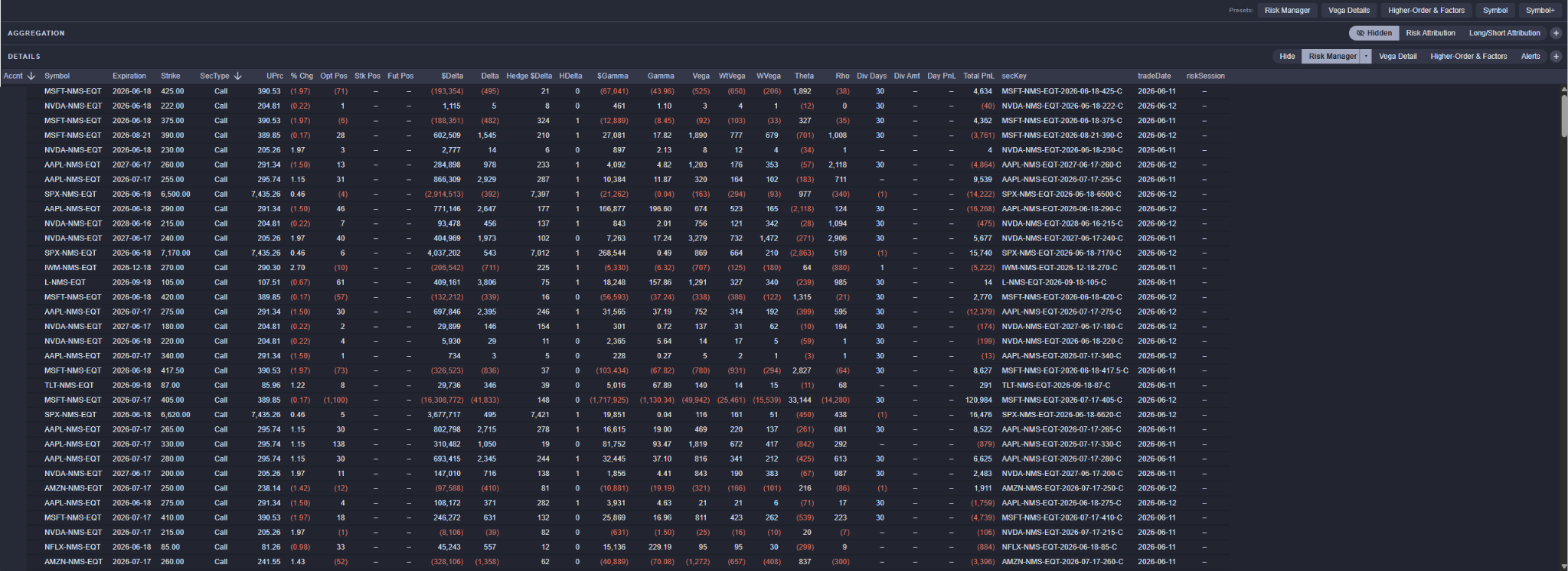
Each module sits on top of one or more SpiderRock backing-store messages. Clients with API access can subscribe to these messages directly to retrieve the same underlying data that SPARC consumes.
| Module | Message |
|---|---|
| Executions | TradeCubeDetailV5 |
| Single Orders | SpdrParentBrkrState |
| MLeg Orders | SpdrMLegBrkrState |
| Auto Hedge | SpdrAutoHedgeState |
| PnL | RiskCubeDetailV5 |
| Risk | RiskCubeDetailV5 |
| MAR Risk Viewer | MarRiskControl, MarRiskControlTkOverride, MarRiskCounter |
| MAR Risk Ctrls | MarRiskControl, MarRiskControlTkOverride |
| Supervisory Ctrls | SpdrRiskControl |
| SymRisk Counters | SymbolRiskCounter |
| Change Requests | ClientConfigChangeRequest |
Risk Control Modules
The Risk Controls group is where a client sees and manages the limits their orders are checked against. The framework itself – the control types, the levels they bind at, and the metrics they carry – is described in Execution Risk Controls.
- MAR Risk Viewer – a read-only view of the MAR limits that apply to the selected account: the net effect of every MarRiskControl that binds it. Each column is one controlling party; controlling parties above a user's entitlement are combined into a single masked column, so the binding limit is visible without exposing who set it. A sticky Amount Available column carries the most restrictive room across all of them.
- MAR Risk Ctrls – the manager view of the MAR controls a user's own firm owns, presented as controller-on-controlled pairs. Every control is keyed by its risk level, so the same controller and controlled party can carry distinct controls at distinct levels.
- Supervisory Ctrls – the editable supervisory (SPDR) controls that bind the selected account, resolved by ticker key and by scope (firm, account, user, and user-at-account).
- SymRisk Counters – the raw per-symbol accumulators published by the execution engines. These are the counters MAR and supervisory controls are evaluated against, so when a control trips or an order goes on risk hold, this module shows the numbers behind it.
- Change Requests – the propose-and-review queue described below.
Change Requests
The MAR Risk Ctrls and Supervisory Ctrls modules are propose-only. Every save or delete raises a Change Request – one control per request – and nothing changes until a reviewer merges it.
Requests land in the Change Requests module, split by the header's Prod / Test toggle so only one book is in view at a time. Clicking a row opens the review dialog, which shows the proposed values against both the current record and the values that were in place when the request was raised. Where the two no longer match, the field is flagged as drift: the record moved under the proposal. Drift is a warning, not a block – the reviewer decides.
Merging runs the change through the target record's own write pipeline under the reviewer's session, re-checking permissions and re-validating every field, and commits only when the whole change lands. A failed merge leaves the request exactly where it was and records the reason on it as a durable comment. Merged and Rejected are terminal; Return sends a request back to the requester for another pass. Comments are append-only, so every decision keeps its author, its time, and its reason beside it.
Deciding on a risk-control request requires the appropriate grant, and the server re-checks that permission on every merge.
Global Functionality
Chip Filters
A user can apply filters to narrow what the Summary Cards, charts, and Aggregations / Details show.
The quickest way to make one is from a grid: hold Ctrl/Cmd and hover a cell – any value that can be filtered on underlines – then click it to add an include filter for that value. Filters can also be built from the + button on the filter row, from a Summary Card row's hover + / – toolbar, and from the symbol column and the Skew × Term grid.
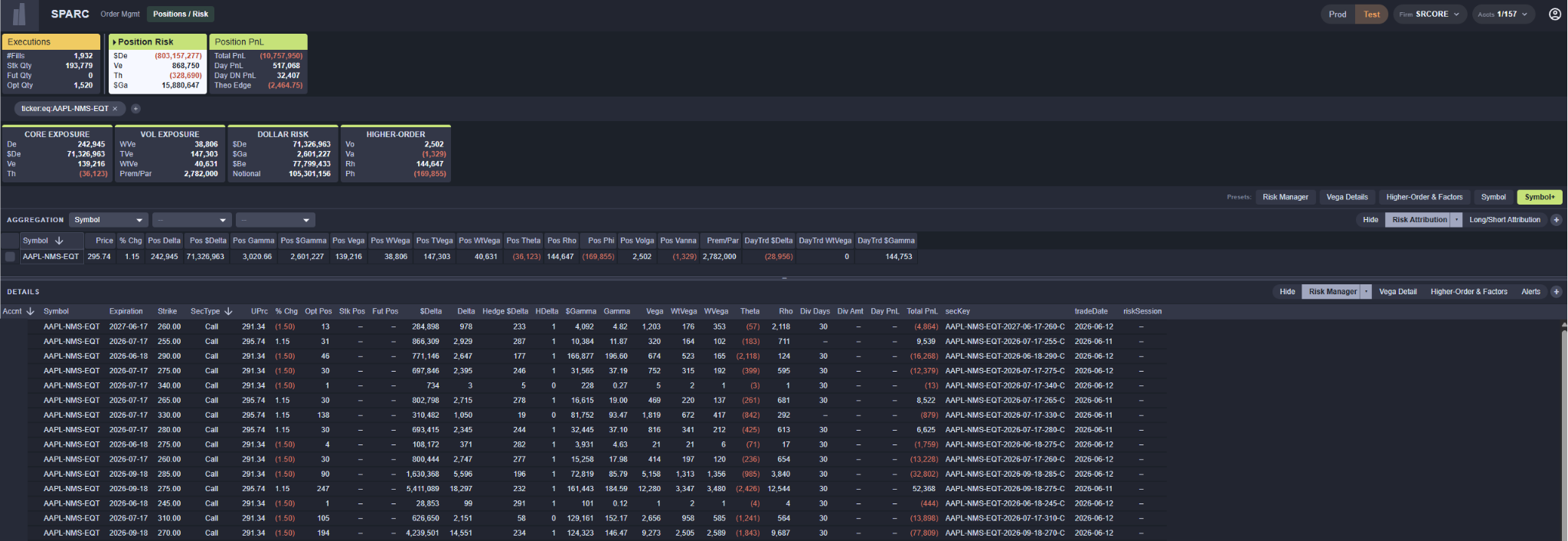
Once added, filters appear as chips in the filter row. Each chip displays the field, operator, and value (e.g., ticker:eq:AAPL). Clicking a chip opens an editor where the field, operator (equal, not equal, contains, starts with, and so on), and value can all be changed – flipping an include chip to not equal is how an exclusion is made. To remove a chip, click the × on it; Clear All appears beside the chips and removes them all at once.
Filters apply to everything below the filter row – the Summary Cards, the charts, and the Aggregations / Details section – but not to the SPARC Tabs or the header selectors above it.
Chip filters persist when a user switches between SPARC modules. If the field from a chip filter is also applicable to the new module, the chip remains active and continues to filter the data on the new tab. If the field is not applicable to the new module, the chip stays visible in the row but turns grey to indicate it has no effect on the current view. Switching back to a module where the field is applicable re-activates the chip automatically – there is no need to recreate it.
Column Sets
Both the Aggregations and Details panels expose their column sets as a connected row of buttons in the panel header, listing all built-in sets for the active module in addition to any custom sets the user has created (custom sets are marked with a small dot). Clicking a set applies it.
The active set carries a caret; clicking it – or right-clicking any set – opens a menu offering Edit, Duplicate, and Delete. The + button at the end of the row opens the Customizer to build a new set from scratch.
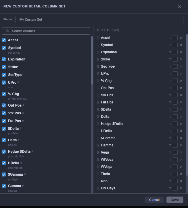
Column Set Customizer
The Customizer lists every column available on the module down the left side, searchable and with the underlying field shown beneath each label. Checking a column adds it to the selected list on the right, where columns can be dragged into the order they should appear and removed with the ×.
Each selected column also carries text and background color swatches, so a user can color columns to assist in readability and scan-ability. Name the set and save it, and it joins the module's column-set row.
Slide Drawer
Clicking any row in the Details grid opens a Slide Drawer from the right side of the screen. The drawer shows the full field set of that record, organized into sections listed down a rail on its left edge (one section per logical group, plus sections for any nested repeating data). The drawer's header bar is colored with the module's accent color. Use the ‹ and › arrows in the drawer to step through adjacent selected rows. Close the drawer with the × in its top-right corner, or by clicking anywhere outside it.
On modules that support editing, the drawer header also carries an Edit button, which opens the record editor for that row. Edits raise a Change Request rather than writing directly.
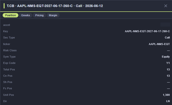
Section Hide
The Aggregations and Details panels can each be hidden independently using the Hide control in their respective headers. A hidden panel can be restored from the same control (which then shows Hidden with a crossed-eye icon), or by clicking any of that panel's column sets.
Guides
Every module carries an in-app Guide, opened from the button at the right edge of the chip-filter row. The guide slides out over the page and is organized into three tabs:
- Concept – what the module is for and what its records represent
- Anatomy – how to read the page, section by section, and what each control does
- Definitions – a table of the labels used on the page, what each one means, and the underlying field it comes from
SPARC Settings
The gear in the header opens SPARC Settings, a dialog with a section rail down its left side. Edits take effect immediately; there is no apply step.
- Current User – the signed-in user's details, the theme selector, and Log Out.
- Display Options – layout preferences, including the width of the symbol column and of the tabs on the SPARC Tab strip.
- Performance – live client and server timing for the session.
- One section per module group, each expanding into its modules. Selecting a module lists its Summary Cards, so individual cards can be hidden from that page without changing their order.